With my first Bushido tourney coming up on the 12th November, I obviously want my warband to look its very best (painted figs fight harder!). To that end I wanted to conduct a poll regarding the look of the bases on my miniatures as I'm conflicted, as is the opinion within the Nerd Herd.

So, as I've been banging on 'ad nauseum' is that Line of Sight (LoS) is imperative in Bushido particularly around surprise attacks etc. As most miniatures are in dynamic poses it is often difficult to determine where the figure is directing their attention! In order to make this easier for all involved the helpful people of GCT studios suggest that you indicate on the base a LoS arc (180 degrees to the front). As they are keen modellers and players themselves they know that people would rather not have prescriptive bases that are all uniform and that takes away the painting/creative aspect of the hobby, so they have left it to the individuals devices to determine how that would look as long as it is clear.
As regular readers of this blog will know I've never been truly happy with the way I have done the bases so now I'm going to leave it up to you guys. So far the majority of the minis in my collection have a generally black base rim with coloured triangle/stripe markings, however recently I've been blending in the faction colours in a stripe around the front arc. I will show you examples of both types of LoS markings, if you can ignore the miniatures and just let me know which style you prefer.
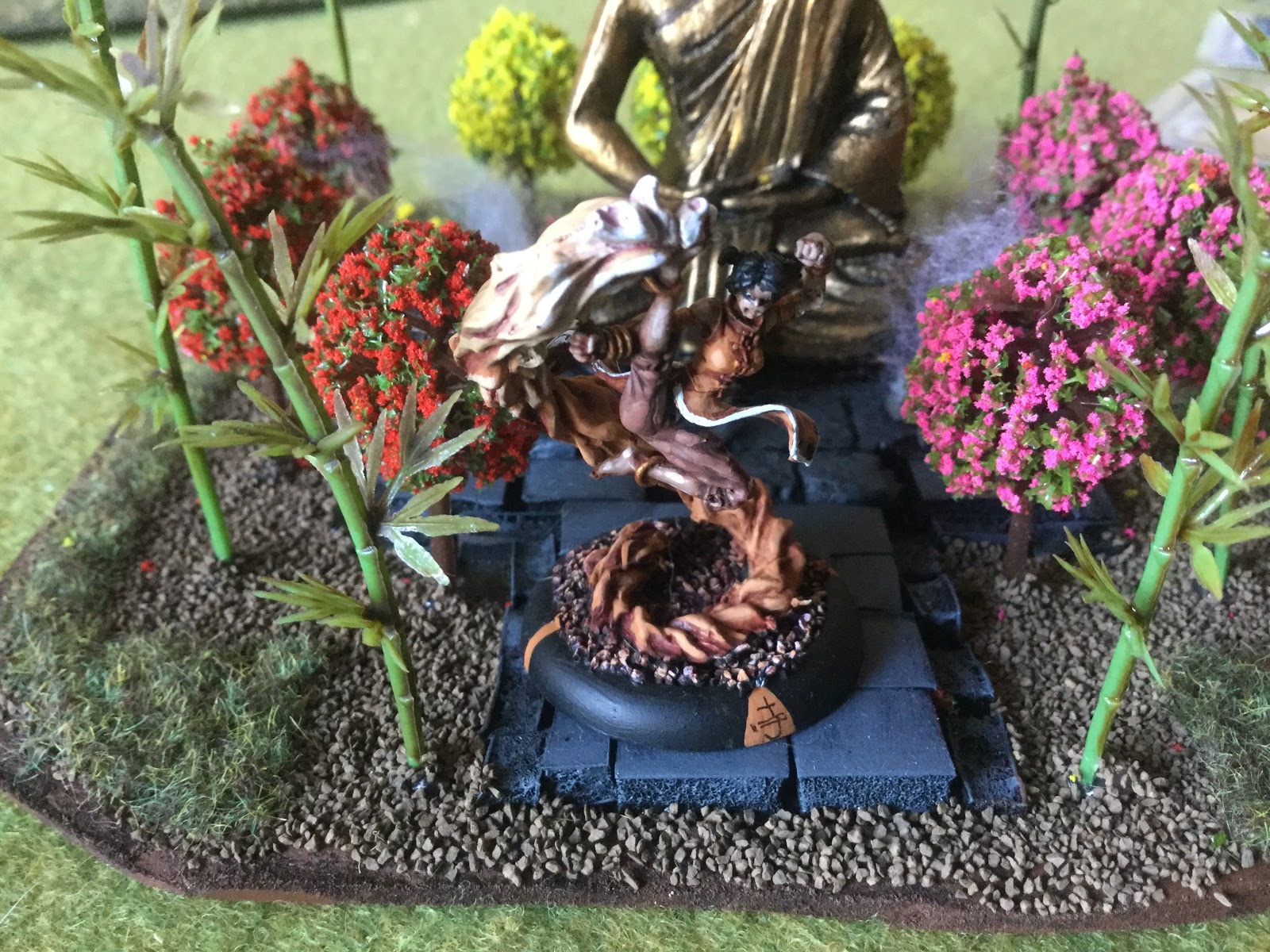
So the first two pics show my Temple of Ro-Kan markings in triangle/stripes

the next two show the blended stripes for the Temple


and for the Prefecture of Ryu in triangles/stripes


and again in the blended stripes


and my latest factions I have only done the blended bases so far


so genuinely looking for you criticism here guys, which style should it be. Competition is coming up soon so am looking for the answer and quick
cheers
dGG
Blended markings is the one I prefer.
ReplyDeleteThanks Phil, one for blended
DeleteYou probably don't want my opinion on this as I really hate slotta -type bases (they're the work of Satan), even more so I hate what I refer to as "Trophy" bases - they're the ones with a curved lip (sorry).
ReplyDeleteRegardless though ifyou're happy with your sty;e then just go for it - you're not really trying to please anyone but yourself are you?
( Iiwah I'd had the patience to go for claer bases as my #1 son has done with all his SAga stuff)
No worries Joe, I love the clear bases but would take forever to rebase my collection! Not an option for Bushido though as it is important to the game mechanic. I'll put you down as a conscientious objector... ;-)
DeleteThis will not help the voting but I prefer the triangles and stripes - esp when you had Japanese characters to them
ReplyDeleteNo worries Martin, one for triangle/stripes:-)
DeleteTriangles and stripes!
ReplyDeleteThanks Fran, 2 for T/S
DeleteI am quite fond of the ones in the first picture it looks so much nicer.
ReplyDeleteCool, thanks Brum 3-1 to T/S
DeleteI, too, prefer the triangle and stripes option.
ReplyDelete4-1 then so far, thanks Bryan:-)
DeleteI'm quite fond of the first group with the triangle and character. So that adds me to the triangle/stripe voting I believe.
ReplyDelete5-1 and thank you for commenting Rod :-)
DeleteAs a gamer, I'd use triangle and stripes as its clearer to see with a quick glance. The black of the base is a useful contrast, and the triangle and stripes reaching from base edge to top trim really helps to see the LoS boundaries.
ReplyDeleteThat said, as a painter, the faded blends are better, insomuch that they don't distract the eye from the miniature (but this is no good when playing and doing quick glances).
Triangle & Stripes for me.
Thank you Roy, I think I can see which way this is going. Your logic is impeccable.
Delete6-1
I actually like the blended ones but I can see how the triangles and stripes would be easier to see so make it 7-1.
ReplyDeleteOh and yes slotta's are the spawn of satan!!!! Tuppences forever (ha ha ha ha, sorry I'll go now).
Cheers Roger.
7-1 it is Roger, thanks as ever ;-)
DeleteI do like the blending effect, but the triangle and stripes just edge it for me.
ReplyDelete8-1, I think I know what I have to do, thanks Michael
DeleteOne for the blended bases here...I find the with the other bases that my eye is constantly drawn to the triangle rather than the superbly painted figures and lovely basing.
ReplyDelete2-8 then Gordon, Thanks for the honest opinion :-)
DeleteTriangle and stripes looks the best.... just my opinion!
ReplyDeleteI appreciate you giving it HW. 9-2
Delete"triangles and stripes - esp when you had Japanese characters to them" - Absolutely!!! :-)
ReplyDeleteThanks Simon - noted!
Delete